Your Menu Is Part of Your Brand

Your menu is often the one piece of your brand customers read from start to finish. When it doesn’t look like the rest (your sign, your packaging, your social media), that’s where the experience breaks.
3 mins • Branding • Nov 2026
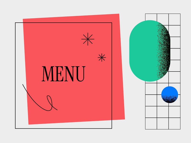
Un carré rouge avec le mot « MENU » en noir, placé à côté d’une grille présentant un grand ovale vert et un petit cercle bleu.

Intro

Your menu is often the one piece of your brand customers read from start to finish. When it doesn’t look like the rest (your sign, your packaging, your social media), that’s where the experience breaks.

“We redid the logo, the sign, the whole space.” “And the menu?” “Oh, the menu… we threw it together the week we opened.”

Sound familiar? The menu often comes last, put together at the last minute or printed as is by the drinks supplier, when it’s the piece your customers hold in their hands the longest.

People actually read menus

In 2012, Sybil Yang, a researcher at San Francisco State University, used cameras to track diners’ eyes as they read a menu. She found no magic “sweet spot” in the corner of the page: people read menus like a book, left to right and top to bottom, and they take their
time. They choose their main dish first, then build the rest of the meal around it.

So your customers are giving you their time. What you tell them with it is your brand.

People actually read menus

It starts with the voice. A neighbourhood café and a high-end bistro don’t describe a dish the same way, and your dish names are brand copy, just like a tagline. Then come the type and colours, the ones from your identity, not whatever the template had by default.

There’s also the hierarchy. What you want to sell should be easy to find, and if everything is bold, nothing stands out. And the format matters, because a paper menu, a chalkboard, a screen and a board above the counter are all read from different distances.

A menu board isn’t a table menu

At the counter, people read standing up, a few metres away, often while the line moves. You need less text, clear categories and prices you can see from a distance. Paste the table menu onto a screen as is, and it quickly becomes a wall of text nobody finishes.

The mistake we see most often? Type that’s too small to read. Right after that comes photos that don’t really look like the dish you get. So our advice is simple: big type or clear images, and not too much content. That’s also what we talk clients out of most often:
trying to fit everything on the board.

When the menu changes, the brand stays

Menus change all the time, with new products, prices that move and seasonal items. That’s why we design them as a system: a grid, heading styles and a few simple rules that let you add a section without redesigning everything. It’s the same idea as in our article on brand consistency, knowing what stays fixed and what can move.

The grid helps even more when the menu runs on screens managed by a third party, or when one change has to go out to every location at once. We saw it with L2 Bubble Tea: when the smoothies section changed, we reworked it on the horizontal and vertical boards without redoing the rest of the menu.

Before you print your next menu

Cover your logo with your hand: would people still recognize your brand? Then look at the page for three seconds. Do the dishes you want to sell jump out? And the next time an item changes, can you add it without redoing everything?

If any of these gives you pause, it’s a good time to talk.

Does your menu say the same thing as the rest of your brand?

Let’s talk.

More Insights you might like

Get the good stuff

Occasional notes on design, strategy, and what’s keeping our agency buzzing.