Brand Consistency vs. Repetition: How to Build a Flexible Brand System

Brand consistency doesn’t mean making everything look the same. It means people recognize your brand even when the layout, format or message changes.

4 mins • Branding • Oct 2026

Intro

Brand consistency doesn’t mean making everything look the same. It means people recognize your brand even when the layout, format or message changes.

Think about some of the companies you recognize immediately.

You probably know their logo. But you also recognize their colours, typography, photography, packaging, stores, advertising and even the way they speak.

That’s the bigger system. A logo identifies the company. Branding creates the world around it.

The Repetition Trap

A single template is reassuring. The logo always sits in the same spot, the headline is always the same size, everyone knows what to do.

But a launch announcement, a technical sell sheet and an Instagram post have different jobs to do. Force them into one template and every message gets the same weight.

And when everything is important, nothing is important.

Consistency is not copying the same layout. It’s protecting what makes your brand recognizable, then letting everything else adapt.

The other trap: no system at all

We’ve seen businesses invest heavily in a new logo and then have no idea what to do with it.

Someone makes a presentation. Someone else creates an Instagram post. Another supplier designs the packaging. A developer chooses fonts for the website. A printer changes a colour.

Six months later, everything technically has the same logo on it, but nothing really looks like the same company.

We see it with packaging too. A company launches with one or two products. Then comes a third, another flavour, a different format. Before long, there are eight products and every package has been solved individually.

That’s usually not a logo problem. It’s a system problem.

A real case: a whiskey brand

A whiskey brand came to us with an established packaging line already on the market. The packaging could have looked better, but the real problem was elsewhere: the brand’s identity wasn’t speaking to the audience it wanted to reach.

Then the line evolved. A new bottle, new flavours. It became clear the existing identity wasn’t strong enough to support where the brand was going. Redesigning a few labels wasn’t enough: we needed to rethink the brand direction and build a packaging system that could grow with future products.

Often, when a brand already has recognition, the logo is one of the elements you want to protect. In this case, the logo was part of the problem.

So we redesigned the logo and created a new graphic and illustration style that became the consistent foundation across the entire line. From there, we introduced a colour- coding system that changes from one flavour to the next. Each product is easy to identify, and they all clearly belong to the same family.

The brand was expanding into new territories. The new direction built excitement around the brand and gave it a stronger presence with retailers and distributors. It opened the door to new listings.

Good packaging doesn’t just look good on the shelf. It helps the brand get onto more shelves.
What stays fixed, what can flex

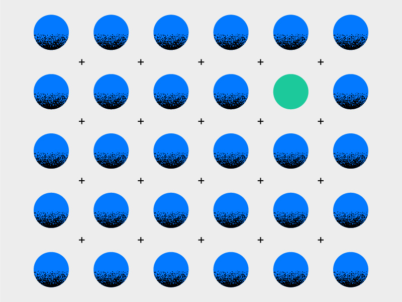
That project sums up the logic. The logo and graphic style are the fixed foundation. The colour coding changes from one product to the next.

For most companies, that foundation doesn’t need to be complicated. We don’t believe every small company needs a 100-page brand manual. A few well-defined colours, typefaces, graphic rules and examples can make an enormous difference.

Everything else can adapt to the job: layout, scale, imagery, how much information goes on the page. A product launch can take up all the space it wants. A technical sell sheet needs more restraint. The brand stays the same.

The test of a good system

When we develop an identity, we think beyond the logo from the start. These are the questions we always ask:

What happens when it goes on a tiny label? On a building, a website, a truck, Instagram? What happens when the company adds a division or launches ten products? Could another designer pick up the brand two years from now and understand how it’s supposed to work?

If your system gets stuck on any of these, or your team is cutting copy to fit the box and quietly making
exceptions, it has become too rigid for the brand you are today.

You don’t have to start over

One word of caution before throwing everything out. The people inside a company see their logo every day.

Eventually, they get tired of it.

Your customers don’t.

A brand builds recognition over time. Changing everything at once can throw away some of that equity. Sometimes the smartest redesign keeps more of the original than the client expected. Other times, the category or the business has changed enough to justify a bigger move, like our whiskey brand.

We’ve done both.

So if you’re rethinking your brand, the more useful question may not be “What should our logo look like?” but: “What do we want our company to look and feel like everywhere our customers encounter us?”

If your brand is recognizable but harder and harder to use day to day, let’s talk!

More Insights you might like

Get the good stuff

Occasional notes on design, strategy, and what’s keeping our agency buzzing.