5 Food Packaging Strategies to Stand Out in Grocery Stores
In grocery stores, everything happens quickly.
It’s time to redesign your packaging when it no longer stands out on the shelf, when your product line has outgrown the original design, or when customers can’t understand it quickly enough. Not just because you’re tired of looking at it.
It’s time to redesign your packaging when it no longer stands out on the shelf, when your product line has outgrown the original design, or when customers can’t understand it quickly enough. Not just because you’re tired of looking at it.
It’s Halloween week, so let’s talk about ghosts. Not the ones in haunted houses. The ones in the grocery aisle: products that are right there on the shelf, but that nobody sees.
On the shelf, design has two very different jobs.
It needs to look good. And it needs to sell something.
Those aren’t always the same thing.
We’ve seen designs that clients still love but that no longer competes well on the shelf. We’ve also seen companies ready to throw everything away when the existing package actually has recognition worth keeping.
As Tony puts it:
“When I look at a grocery shelf, the first sign a product has become invisible is when I can’t immediately tell what the product is or why I should buy it. Consumers only have a few seconds to notice a product. If the packaging is too busy, the messaging is unclear or everything looks the same, the product gets lost. For me, good packaging needs to do three things: grab attention, communicate clearly and give consumers a reason to pick it up.”
So when is it time for a redesign?
Your product doesn’t live alone. It sits beside other products. Sometimes dozens of them.
A design that stood out eight years ago may disappear today because the category around it has changed.
That’s why we always look at competitors before we start:
The goal isn’t simply to look different. It’s to understand the environment your product has to compete in.
This is one of the biggest problems we see: too much information.
Everyone inside the company has something they want on the front. Marketing wants one claim. Sales wants another. Someone wants
“NEW.” Someone wants the flavour bigger. Someone else wants an ingredient callout.
Eventually everything is important, which means nothing is important. And a design that says everything ends up saying nothing, which is another way of disappearing.
What you need is hierarchy. If someone sees your product for a few seconds, what should they understand first? Then second? Then third?
That’s a design decision, but it’s also a business decision.
This happens a lot. A company launches with one or two products. Then comes a third. Then another flavour or type. Then a different format.
Before long, there are eight products and every new design has been solved individually.
That’s usually when we start seeing problems. The colours don’t work together. Product names aren’t always in the same place. Some products have more information than others. New designers or suppliers have interpreted the brand differently.
Taken one by one, the boxes may not be terrible. The system is what’s breaking down.
Maybe you’re moving into larger retailers. Maybe you’re entering another market. Maybe a product that started at farmers’ markets is now competing against national brands. Maybe your pricing has increased and the package no longer reflects the quality of what’s
inside.
Those can all be good reasons to revisit the design.
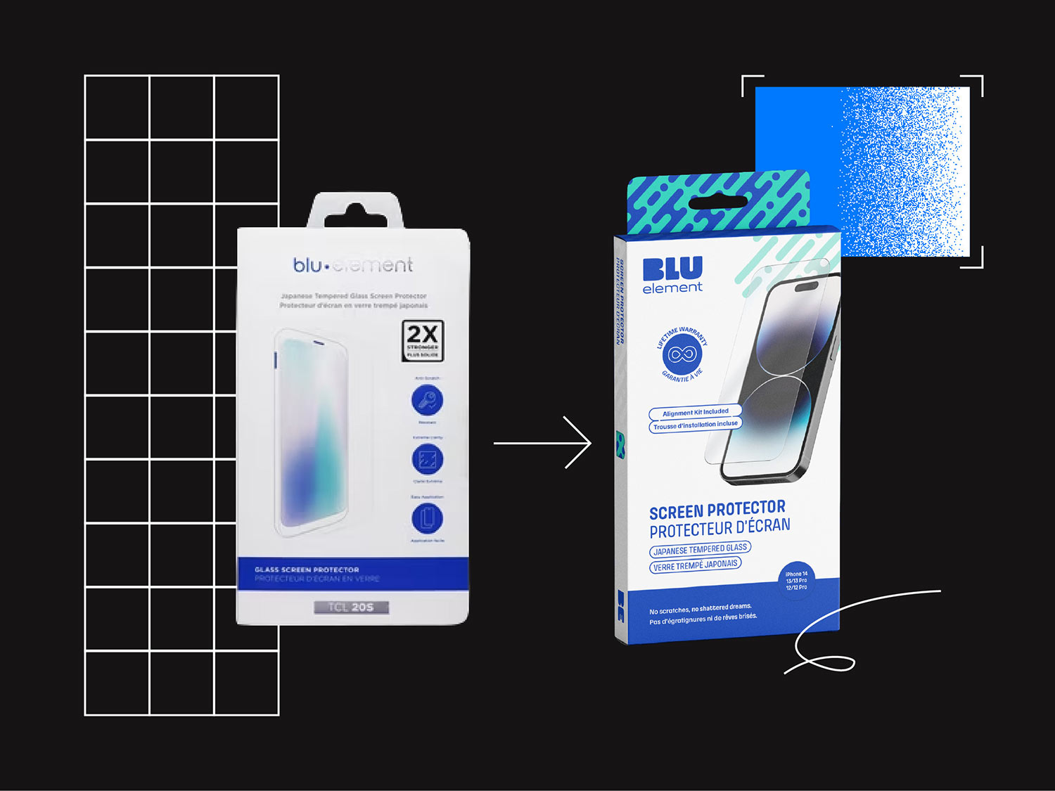
That’s what happened with Blu Element. The brand was originally positioned as a house brand, and it struggled to stand on its own and attract retail buyers.
We helped reposition the brand with a new logo, messaging and packaging that better communicated its identity and product benefits. We also looked at its structure, eliminating plastic and reducing production costs by close to 50%.
The result was a stronger, more recognizable brand that helped open doors to big-box retailers and attract new buyers.
This is important. Packaging can build recognition. Customers learn colours, shapes, logos and visual cues. Changing everything at once can throw away some of that equity.
That’s the other way to become a ghost: changing so much that your regular customers walk right past you.
Not every brand needs a complete redesign. Sometimes a client already has a strong logo or recognizable elements that are worth keeping. If those elements still support the brand’s direction, there’s no reason to change them. Our role is to guide clients toward the right decisions, even if that means recommending fewer changes.
Sometimes the smartest redesign keeps more of the original than the client expected. Other times, the category or business has changed enough that a bigger move is justified.
We’ve done both.
The goal isn’t to make the package newer. It’s to make it work better for where the product is going next.
If your product is starting to fade into the shelf, let’s talk.
In grocery stores, everything happens quickly.
Your packaging is much more than just a wrapper.