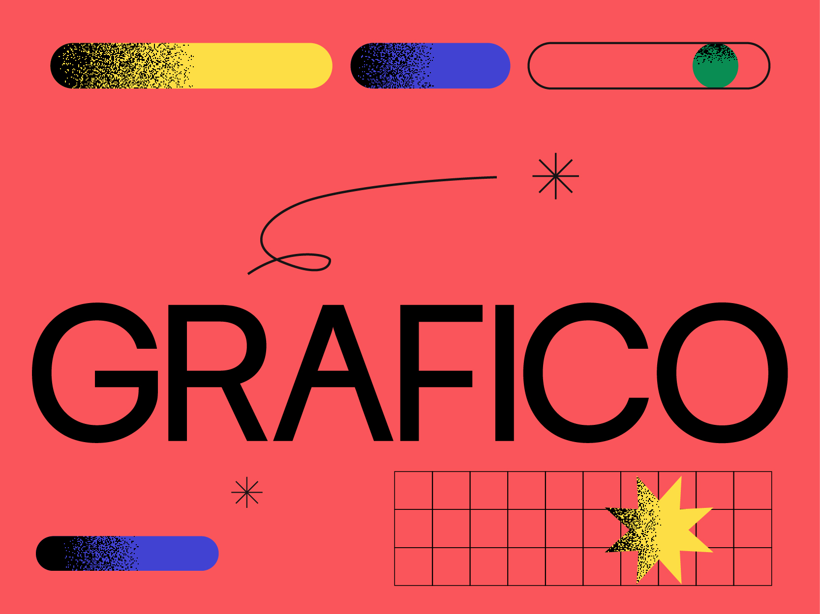
More Than Design: Why Design Grafico Evolved After Nearly 30 Years
After nearly 30 years in business, one thing has become obvious to us.
Typography plays a much more important role than one might think in a brand identity.
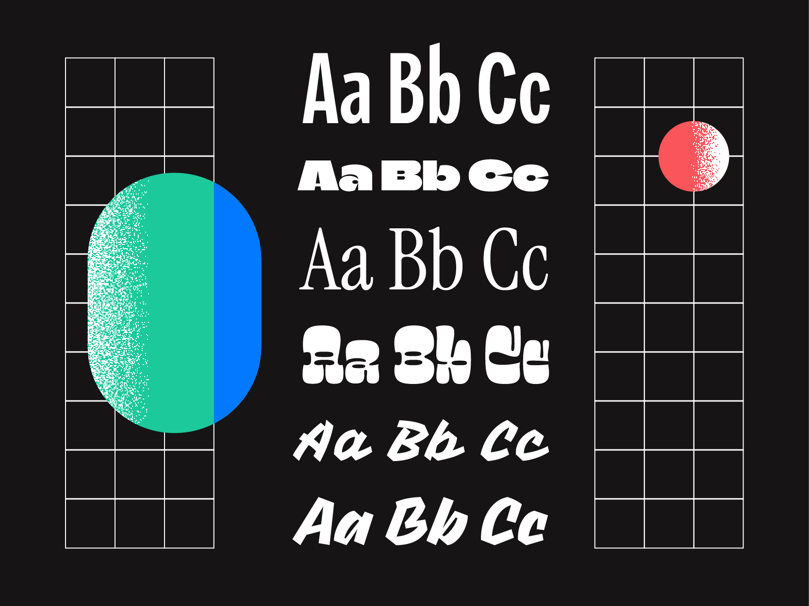
Typography plays a much more important role than one might think in a brand identity. In the same way as colors, images or the logo, it directly influences the way a company is perceived.
Each font has its own personality, its own rhythm and its own way of communicating an emotion. The typographic choice can make a brand more elegant, more modern, more human, more high-end or more daring.
At Grafico, we consider typography as a true strategic tool. A good selection of fonts allows not only to strengthen the visual identity, but also to improve the consistency and legibility of all communications.
Here are 4 essential principles to understand the importance of typography in branding.
Typefaces convey an immediate perception.
Certain typographies appear:
The choice of typography must therefore be aligned with your positioning, your audience, and the image you wish to project.
Typography contributes directly to building the visual tone of your brand. In some projects, it even becomes the central element of the identity, particularly when it is personalized or adapted to measure for a logo.
A strong identity relies on consistency.
This is why it is important to limit the number of fonts used and to clearly define their role: a font for headings, one for body text, and sometimes an accent or display font.
This structure allows for the creation of a visual system that is clearer and more recognizable across all media:
Consistent typography strengthens brand recognition and creates a more professional experience.
A font can be very aesthetic… but if it is difficult to read, it quickly loses its effectiveness.
The primary role of typography remains communication. Messages must be easy to read, understand, and pleasant to consult.
Readability depends on several factors:
More expressive typographies can be used to create graphic impact, but they must always remain balanced with more functional choices for the main content.
A good typographic selection must also take into account the technical and operational realities of the client.
The chosen fonts must be accessible, compatible with the tools used, easy to deploy, and adapted to different media.
At Grafico, we always seek to create effective typographic systems, but also realistic ones for the teams who will use the brand on a daily basis.
A strong typographic identity must be designed to last and function concretely in the company’s reality.
Typography is not just for writing words. It participates in the way your brand speaks visually.
It influences:
When chosen well, typography becomes a true brand pillar capable of strengthening consistency, memorability and connection with your audience.
Typography is much more than an aesthetic choice. It acts as a direct extension of your brand’s personality and voice.
At Design Grafico, we support companies in Montreal and Canada in creating consistent, strategic and sustainable visual systems, where every detail, including typography, contributes to building a strong and memorable brand.
After nearly 30 years in business, one thing has become obvious to us.

After nearly 30 years of building brands, Tony Moriello has developed a vision of branding that runs counter to several industry trends.

There is one question that comes up almost at the beginning of every project: “How much does it cost?”